What the 2023 Colours of the Year Say About our Collective Emotional State
Paint companies and designers study colour trends to predict a colour of the year. Everything from politics to fashion and cocktails plays a role in the analysis. Colours that rise to the surface show the desires of our collective heart. They are how we express ourselves and reveal our aspirations. Given the psychological nature of colour choices, we have categorized the 2023 colours of the year to determine how we, as a society, are feeling.
Undertones of Red, Underlying Energy
The majority of 2023’s colours have at least hints of red or pink undertones. Red indicates passion and energy while pink leans into caring, tenderness, and calm.
Canyon Ridge by Better Home and Gardens is a spin on terra cotta. Orange meets pink to infuse energy and comfort into any space. The warm tone is available exclusively at Walmart. It’s considered a near neutral reminiscent of a golden hour sunset. Orange represents change and creativity, so the orange undertones mixed with pink evoke a calm optimism.
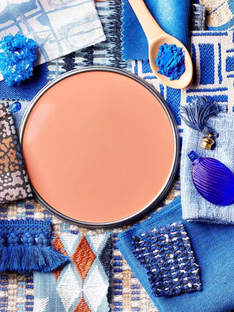
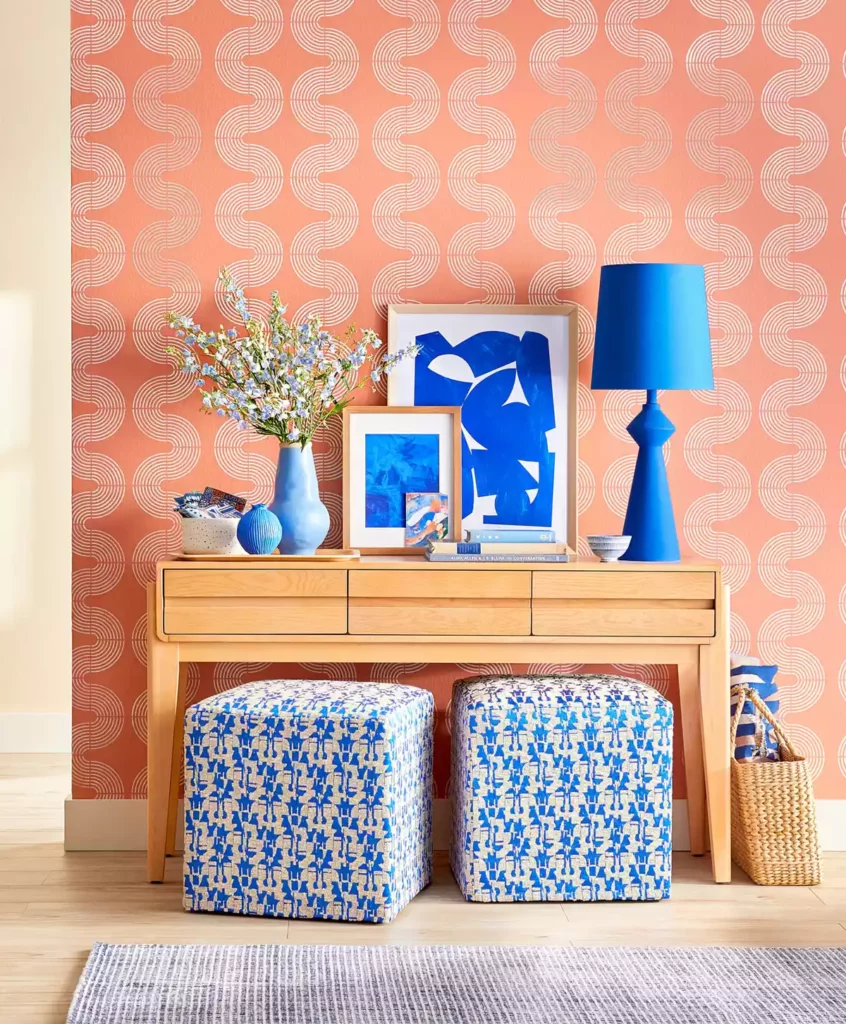
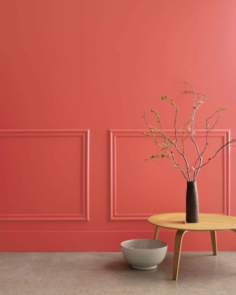
Raspberry Blush by Benjamin Moore is a saturated red-orange that enlivens surroundings while awakening the senses with charismatic colour. As with Canyon Ridge, Raspberry Blush combines the creativity and change of orange with the passion and energy of red. It is unapologetic in its boldness, encouraging a confident colour statement that communicates energetic creativity.
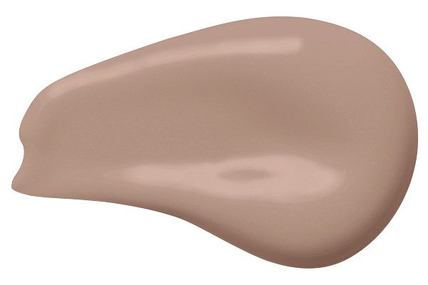
Redend Point by Sherwin Williams is a soft and soulful neutral that blends blush and beige. The subtle pink undertones indicate care, appreciation, and deeper relational connection.
Terra Rosa by Dunn Edwards is a deep, rosy pink hue with a touch of terra-cotta influence that exudes confidence, creativity and coziness. This blend of brown and burgundy results in a soft, earthy pink in the family of Canyon Ridge. The earthy, natural colour creates a calm, Mother Nature vibe.
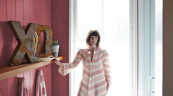
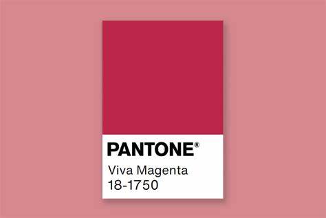
Viva Magenta by Pantone is not for the colour-shy. Red meets pink in a new animated shade that “revels in pure joy, encouraging experimentation and self-expression without restraint.” Viva Magenta is where primal instincts meets playful youthfulness. It simply can’t be ignored. Pink makes the red less aggressive while also exhibiting a pulsating hue of joyous and optimistic celebration.
Neutral Tones, Impressionable Backdrops
Neutral colours are impacted by the colours that surround them, making them more akin to a backdrop than a statement. That being said, some hues are more timeless than others.
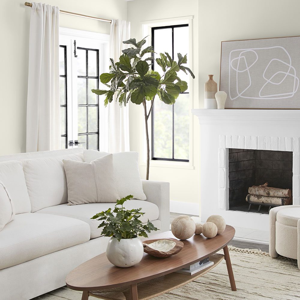
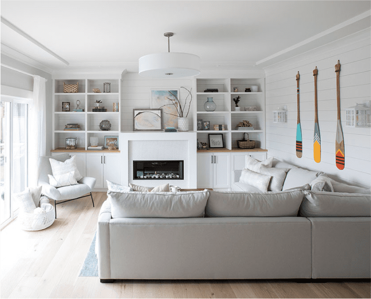
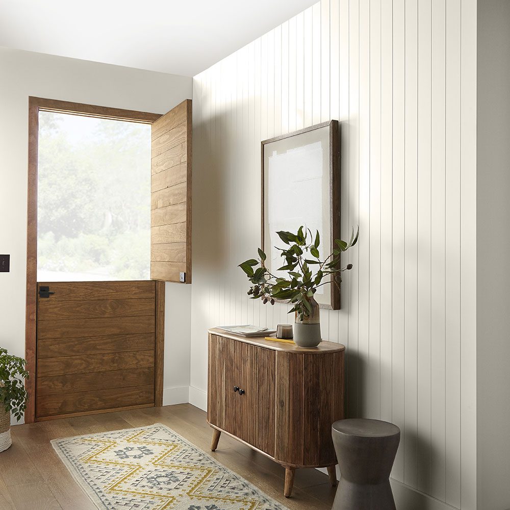
Blank Canvas by Behr lives up to its name by being a hopeful and welcoming, creamy white. As a warm neutral, it works to set the stage for contrasting accent pieces.
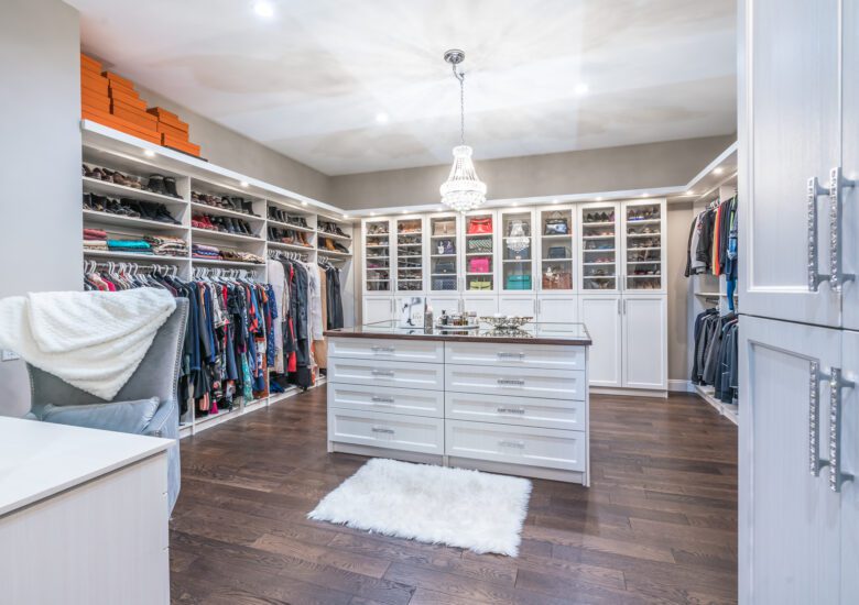
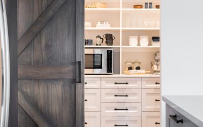
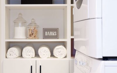
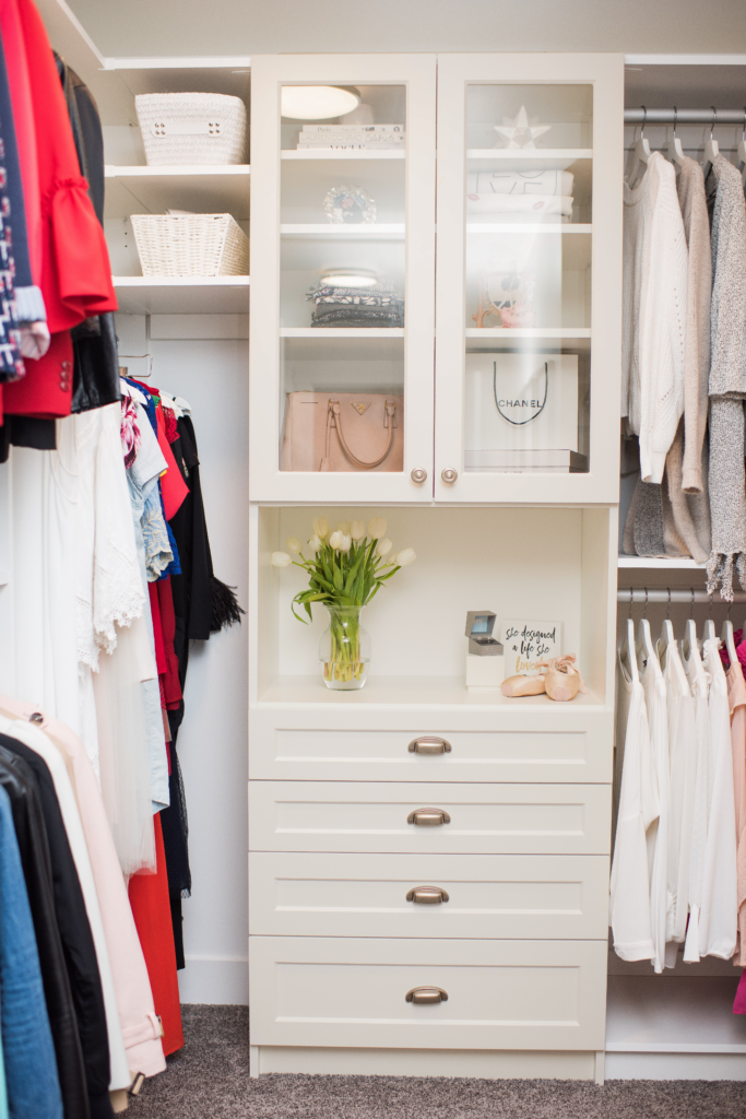
Similarly STOR-X’s storage cabinet finish available in Matte Whitesmoke will provide an on-trend yet timeless neutral base.
Darkroom by HGTV Home evokes elegance and romance in a comfortable way. It is an alluring black that works as a classic for heritage interiors or a modernly-retro, throwback-inspired aesthetic. It’s a new neutral that creates dimension.
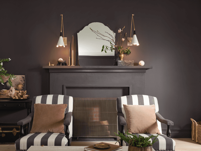
Black and white. These are the basics, the way we delineate and categorize. Their presence as colours of the year indicate less contentment with the unmoored land of greys.
Nature’s Serenity
Earth tones bring comfort and joy. They promote an overall sense of wellbeing by borrowing from the cozy calm of the outdoors. Even humans living in developed countries find a sense of protection under the branches of the natural world.
Aged Barrel by Minwax celebrates wood’s natural imperfections. It is neutral, warm and dependable, highlighting the serenity associated with soothing wood grains.
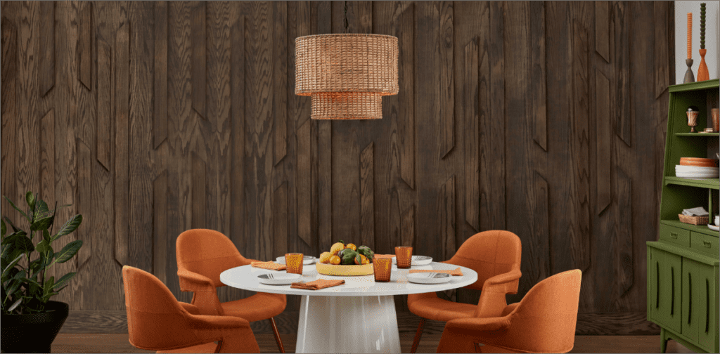
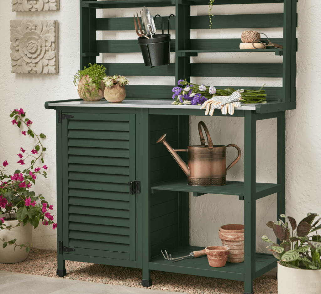
Spanish Moss by Krylon also borrows from nature’s colour palette. A subdued hue of green, this nod to nature conveys renewal and affluence in a peaceful, new neutral tone.
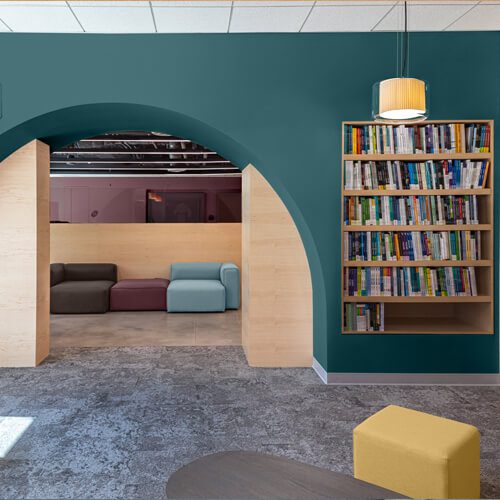
Vining Ivy by Glidden and PPG is a “bluish-greenish-something-in-betweenish” colour that serves up versatile vibes, making it an on-trend addition to any room. The blue-green jewel tone says calm, relaxed, and reserved.
Summary
Overall, 2023’s colours indicate we desire a renewed sense of calm and comfort, but we also have undercurrents of passion and energy that may be waiting to erupt.
