Renew and Refresh: Design and Color Trends for 2021
Looking ahead at all the promise and potential that we’re hoping to see in 2021, what better time to look around and see where we can renew our living spaces or refresh them with an updated shade? Out with the old and in with the new has taken on a whole new meaning these days.
Think how much a new coat of paint can stir emotions and change perspectives. Rearranging a room can instantly shift the focus to a favourite item of furniture or even a work of art. Adding a new accent piece here and there can help create subtle themes.
So with that in mind, it’s the perfect time to talk about 2021’s design and colour trends and how they can be incorporated into your home.
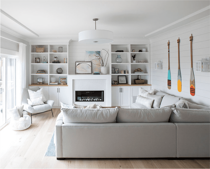
Design: Own the Space
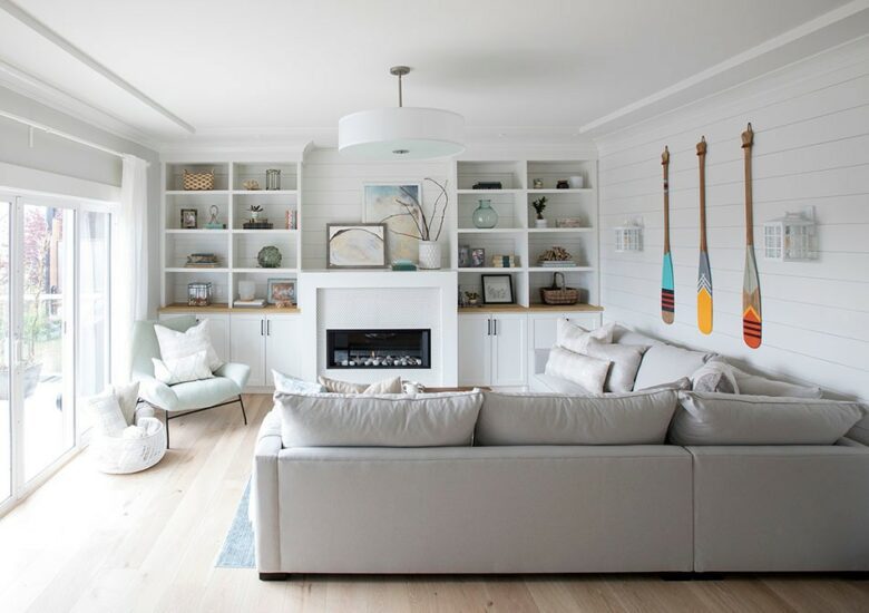
2021 is the year you can get serious about setting the tone or mood in your space. So don’t just decorate it, own it. Explore character. Develop themes. Make your space a true expression of yourself and your life.
For those with a hankering to simplify, get cozy with rustic vogue. Embrace nature and settle in with cottagecore. After the emotional rollercoaster that was 2020, no one is going to fault a yearning for comfort or sanctuary. If yesteryear appeals to you, discover nostalgia or vintage modern. Have a more global view in mind? It’s a prime opportunity to showcase history or cultures.
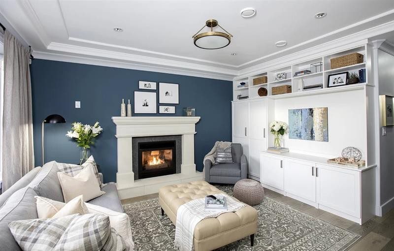
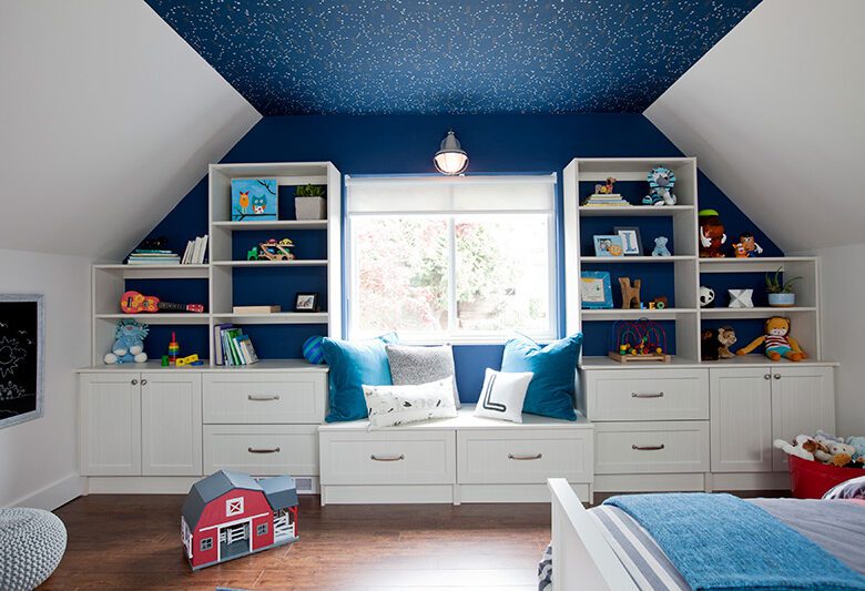
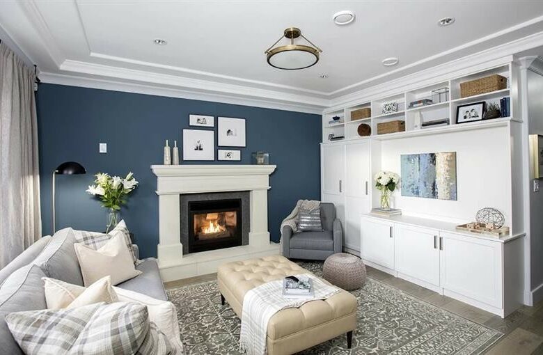
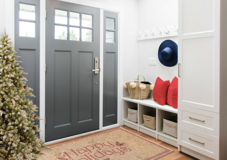
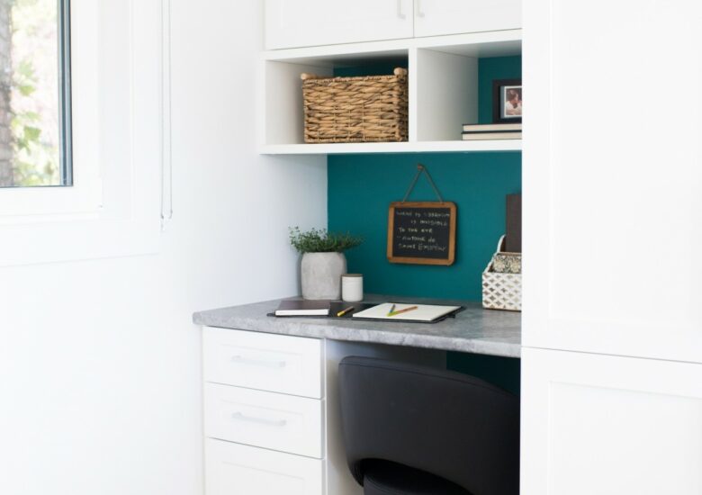
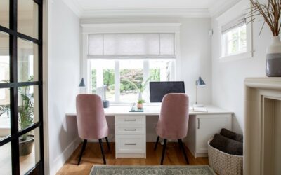
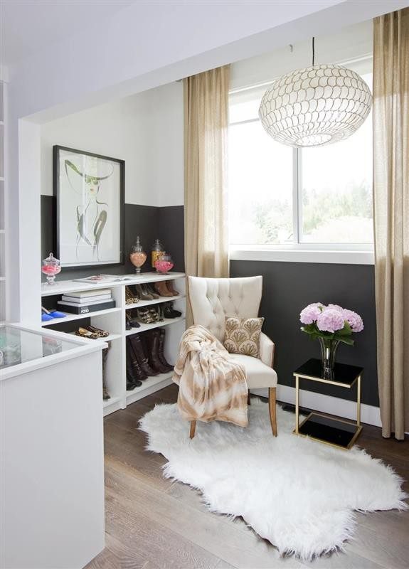
Not sure about redoing an entire floor or room? Start small. Pick a focal point like a door or stairway. Experiment with accent pieces or use colour in unexpected places: do one wall and make that the centre of attention where a favourite painting is displayed.
Colour: Paint a Vision
There is power, psychology and pure emotion behind colour. It can inspire, relax, uplift, empower and soothe. We use colour to tell others about our personal tastes, styles and characters. Considering the impressive array that makes up 2021’s colour palettes, it’s a great time to take a look around and see how and where we can bring them into our lives.
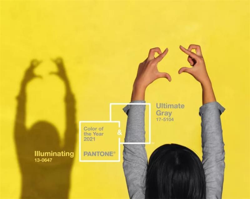
- The Pantone Color Institute – the business unit inside Pantone that forecasts colour trends through forecasts, colour psychology and colour consulting – recently announced its 2021 colours: Illuminating and Ultimate Grey. As the organization so aptly describes them, the colours are “practical and rock solid but at the same time warming and optimistic”. Seen as a union of strength and positivity, the Institute notes that they represent “…a message of happiness supported by fortitude”.
- The colour of the year from Dulux is Brave Ground, “…a bolstering shade that connects back to nature and the simple things.” This warm, earthy tone “…creates a feeling of stability, growth and potential; and provides a firm foundation for change and creativity in your home.” Because Brave Ground pairs so beautifully with other shades, the experts at Dulux have provided four accompanying colour palettes known as expressive, trust, timeless and earth. They’ve also identified three nurturing palettes – Retreat, Nourish and Reset – that “…evoke familiarity and comfort” while creating a sense of renewal.
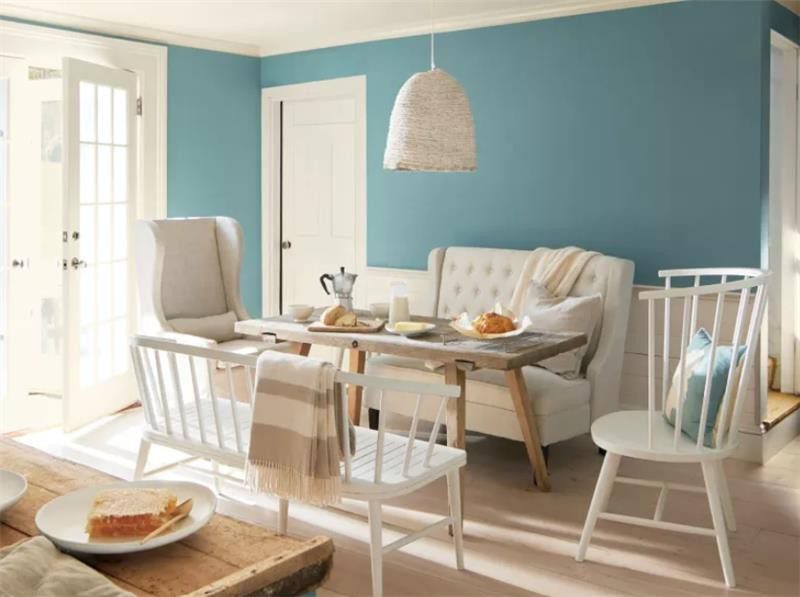
- Benjamin Moore’s Colour Of The Year is Aegean Teal – a warm blue-green with gray undertones. This shade was chosen for its ability to “…add balance and calm to spaces.”
Closing the book on the last chapter of 2020 means looking forward to 2021 and all the possibilities that lay ahead. And since we’re still planning to spend time at home, 2021 is also a great time to see how we can renew and refresh our current living spaces.
